UI Components
TextView
UI component for multi-line text entry.
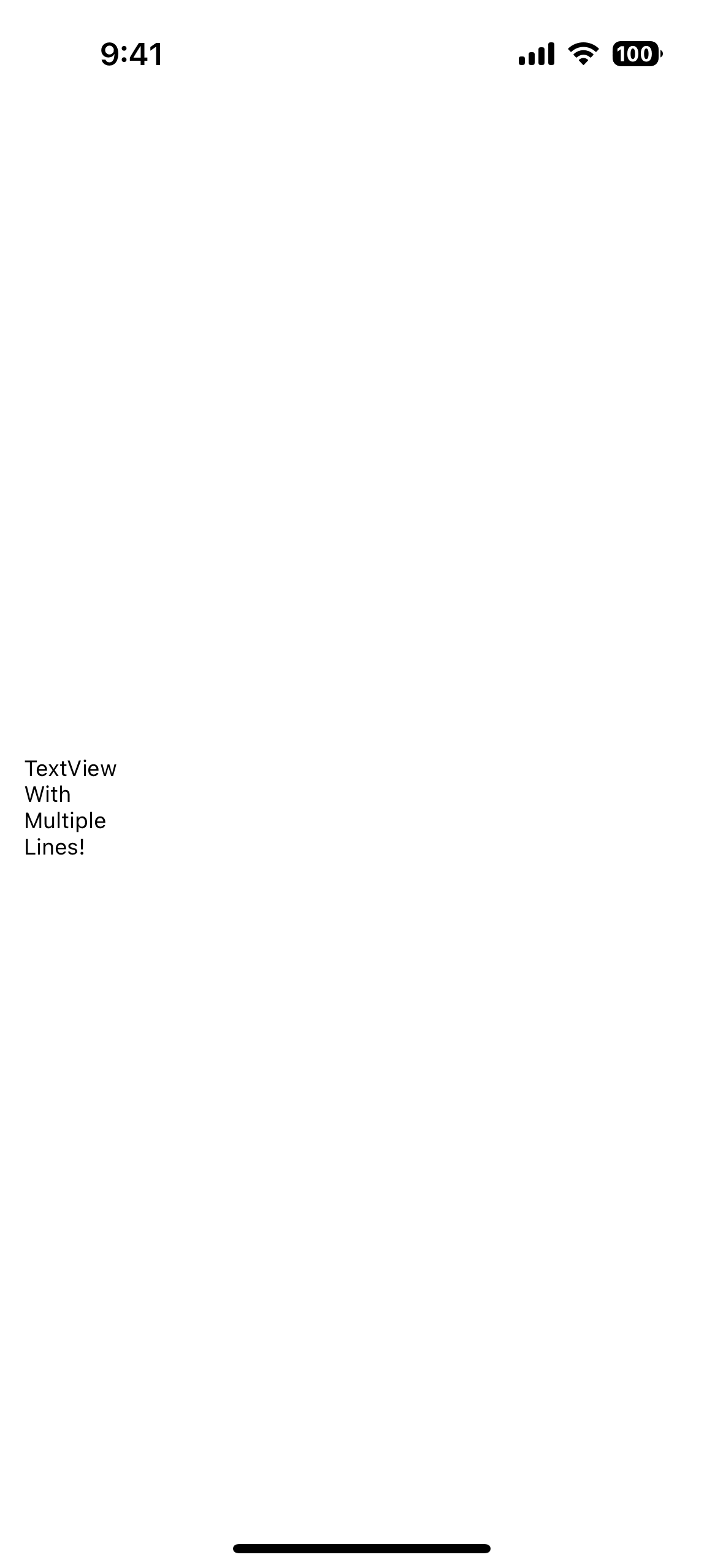
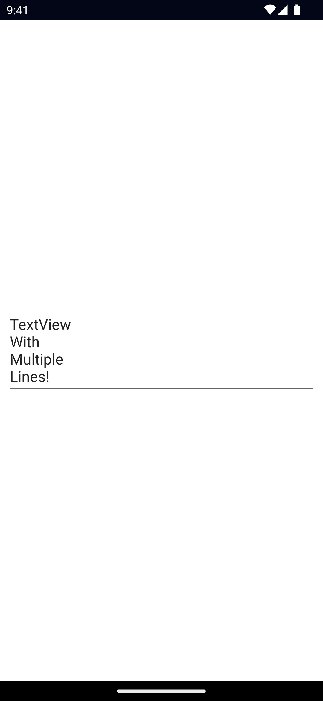
<TextView> is a UI component for multi-line text entry. When set to read-only, it can also be used to display multi-line text.
For single-line text input, see TextField.


<TextView text="{{ text }}" />const text = `TextView\nWith\nMultiple\nLines!`Examples
Formatting text inside a TextView
If you need to style parts of the text, you can use a combination of a FormattedString and Span elements.
<TextView>
  <FormattedString>
    <Span text="This text has a " />
    <Span text="red " style="color: red" />
    <Span text="piece of text. " />
    <Span text="Also, this bit is italic, " fontStyle="italic" />
    <Span text="and this bit is bold." fontWeight="bold" />
  </FormattedString>
</TextView>
Props
text
text: stringGets or sets the text of the TextView.
hint
hint: stringGets or sets the placeholder text for the TextView.
editable
editable: booleanWhen set to false the TextView is read-only.
Defaults to true.
keyboardType
keyboardType: CoreTypes.KeyboardType | number // "datetime" | "email" | "integer" | "number" | "phone" | "url"Gets or sets the keyboard type shown when editing this TextView.
On iOS, any valid UIKeyboardType number works, for example:
keyboardType = 8 // UIKeyboardType.DecimalPadSee CoreTypes.KeyboardType, UIKeyboardType.
returnKeyType
returnKeyType: CoreTypes.ReturnKeyType // "done" | "go" | "next" | "search" | "send"Gets or sets the label of the return key.
isEnabled
Allows disabling the TextView. A disabled TextView does not react to user gestures or input.
Default value is true.
maxLines
maxLines: numberLimits input to the specified number of lines.
autocorrect
autocorrect: booleanEnables or disables autocorrect.
...Inherited
For additional inherited properties not shown, refer to the API Reference.
Methods
focus()
focus(): booleanFocuses the TextView and returns true if the focus was succeessful.
dismissSoftInput()
dismissSoftInput(): voidHides the on-screen keyboard.
Events
textChange
on('textChange', (args: PropertyChangeData) => {
  const textView = args.object as TextView
  console.log('TextView text changed:', args.value)
})
Emitted when the input text changes.
Event data type: PropertyChangeData
returnPress
on('returnPress', (args: EventData) => {
  const textView = args.object as TextView
  console.log('TextView return key pressed.')
})
Emitted when the return key is pressed.
focus
on('focus', (args: EventData) => {
  const textView = args.object as TextView
  console.log('TextView has been focused')
})
Emitted when the TextView gains focus.
blur
on('blur', (args: EventData) => {
  const textView = args.object as TextView
  console.log('TextView has been blured')
})
Emitted when the TextView loses focus.
Native component
- Android:
android.widget.EditText - iOS:
UITextView
- Previous
- TextField
- Next
- TimePicker

